|
Ever wonder why logos are so basic and high contrast? Here's a great example. A group of people in the Coombs area are celebrating their western heritage and plan to bring rodeo back to the area. A daughter of one of the founding members drew an intricate grey-scale picture to use as the logo for the group. At first there was a bit of disappointment that I simplified the drawing while adding the words to turn it into a logo but they came to understand how the the more details there are in a drawing the more details are lost when it is scaled down. Since most logos need to be small enough to be used on smart phones, letter heads, and business cards, a simplified image is best. Scroll down to see the logo in two different sizes and compare details. You can find out more about the group's goals and fundraising events on their facebook page. 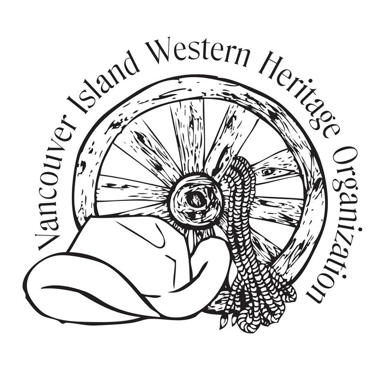 In a large scale it is easy to see quite a bit of detail. 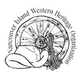 In a small scale we start to lose detail.
0 Comments
Leave a Reply. |
Archives
January 2015
Categories
All
|
 RSS Feed
